Article • 10 min read
Creating a sell sheet: Sell sheet examples, template, and design
A sell sheet can pitch your product to hundreds of prospects at the touch of a button—if it’s designed well. Here’s how to create one that gets results.
Por Donny Kelwig, Contributing Writer
Última atualização em August 16, 2023
In a perfect sales world, there would be enough time and resources to give a relaxed, in-person sales presentation to every single prospect. There’d be coffee and bagels, and you’d have the chance to lay out every detail of your company and products.
Unfortunately, that’s rarely the case.
Because time and resources are scarce—and you may be reaching out to hundreds of prospects in a short amount of time—a solid sell sheet is a must.
Product sell sheet vs. company sell sheet
There are two main types of sell sheets your business may want to create:
- Product sell sheet
- Company sell sheet
The two are very similar in terms of goals (simplicity, clarity, incentive), but they differ with regard to focus.
Product sheets highlight a specific, individual product or service. They obviously mention the company making the product or offering the service, but they don’t focus on it. Product sheets are ideal for newer or established companies that provide only a single product or service. They can also pre-address common sales objections.
Company sell sheets focus on the business itself, with some mention of the products or services it provides. These sheets are excellent introductions that can include information on the company’s statistics, mission, and leaders.
Both types of sheets feature the same basic concepts of design.
Sell sheet design
There are endless ways to design a sell sheet, but a great sell sheet will nearly always contain three fundamental elements: strong imagery, persuasive copy, and a simple call to action.
Let’s look at each element in more detail before diving into an example.
Strong imagery
Today’s audiences only read about 20 percent of the text put in front of them if there are text blocks of more than 600 words. So, an eye-catching image can be more effective in promoting your product or business than a big chunk of text.
An eye-catching image can be more effective in promoting your product or business than a big chunk of text.
All sell sheets will need some form of imagery, but these are a few graphics your marketing team will want to pay close attention to:
- Logo: While your company logo is critical to your branding, it’s not necessarily your strongest image. Logo prominence is key when your logo is recognizable, but if you’re a relatively new company, keep your logo small. It can be there without being the focal point.
- Product photo(s) or illustration(s): If you’re creating a product sheet, the most prominent item on your page should be an image of your product. Whether it’s a photo or a drawing, an image of your product in action will always be the top selling point for a customer. Don’t use text to tell your prospects what your product does—use an image that shows them.
Persuasive copy
With a limited word count, it’s essential to choose every word on your sell sheet carefully. Keep in mind that your prospects don’t want to know about your product—they want to know why your product would be beneficial to them.
Your prospects don’t want to know about your product—they want to know why your product would be beneficial to them.
For instance, say you’re selling a new model of a heavy-duty backpack, and you want to promote durability, lightweight material, and comfortable straps. There are two ways to do this:
Our heavy-duty backpack is durable, lightweight, and comes with state-of-the-art straps that are designed for comfort. Backpack Company is dedicated to creating the best and strongest backpacks for all customers.
Hikers and students can say goodbye to back pain with our new heavy-duty backpack. Lightweight materials and comfortable straps help keep your back straight while durable pockets mean you can feel confident in a long-term purchase.
Concise, customer-focused copy is key to your sell sheet.
The first promotion focuses on the product. While it’s not incorrect, it doesn’t tell the prospect why they need the backpack. No matter how many good features a product has, simply mentioning them does nothing to explain why the consumer should go out and buy it.
The second promotion focuses on the customer. All the same product points are included, but this time, the prospect is drawn to the backpack because it fixes two problems for them: back pain and replacement cost. A good promo should mention the features of the product while also addressing the specific problems those features are meant to solve.
Concise, customer-focused copy is key to your sell sheet.
Simple call to action
Captivating imagery and copy don’t mean anything without a call to action (CTA). A prospect may be interested in your product, but they need to know what to do next. Most people won’t take the initiative to seek out your website or find your purchase page or store location without some kind of prompting.
Captivating imagery and copy don’t mean anything without a call to action (CTA).
By providing that prompt, your CTA serves as a guiding light for customers. And the good news is that it doesn’t need to be complicated. A simple QR code or a link with a “Start your free trial” or “Get your copy” button goes a long way towards converting your prospects from interested consumers into fledgling customers.
Sell sheet example
Now that we’ve explored the essential elements, let’s look at a successful sell sheet and see each component in action.

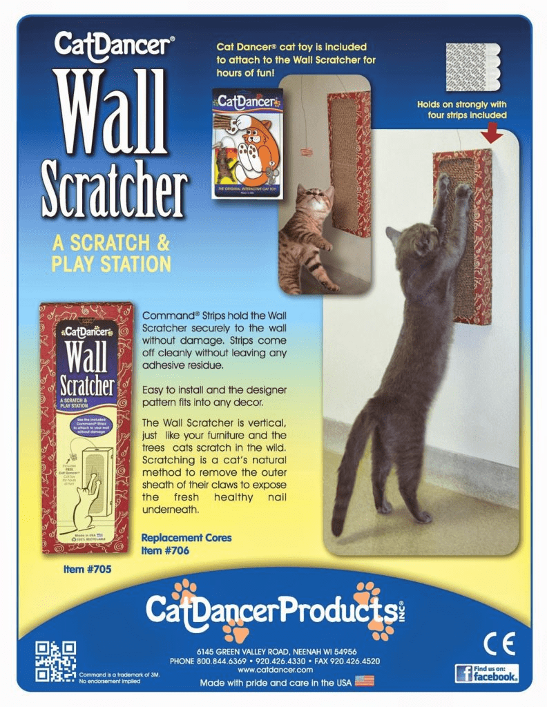
This is a product sell sheet for a new wall scratcher from Cat Dancer Products Inc.ⓒ There are several aspects that make this sell sheet successful:
The images are fun, relevant, and display the ideal use of the product. There is also a photo of the packaging so the buyer can easily recognize the product, and the image of sticky strips illustrates how the product is installed.
The text is clear and supports the imagery. This is critical because you don’t want vital information to get lost in the text. It should provide additional details that back up the images instead of introducing completely new information.
The copy is customer-focused. By just looking at the sell sheet, the prospect can quickly identify how the product solves some of the common problems that come with having a scratch-happy cat. They can see that the product will entertain their cat, stick to their wall without damaging the paint, and decrease the length of their cat’s claws to protect the rest of their furniture.
- There are numerous ways to contact the company or purchase the product. At the bottom of the sheet, you’ll notice a QR code, an address, a phone number, the website, and a CTA to find the company on Facebook. That’s a lot of sales enablement packed into a small space, but it’s easy to read. And depending on the prospect’s location and demographic, they can choose the best way to contact the company for themselves.
- The sell sheet contains all the key information you would find in an in-person sales pitch example for this product. This demonstrates clear branding and consistency across company marketing.
The motherlode of sales email templates
We’ve compiled 24 email templates that cover every sales pipeline stage, from prospecting to closing.
Sell sheet template
There certainly isn’t one go-to format for a sell sheet, but there are templates that can be extremely useful. If your company isn’t set up to make sell sheets, you can contract with a company like Proposify or Visme to compile your content into a sales-friendly sheet.
Here are a couple of templates and what they might be best used for:

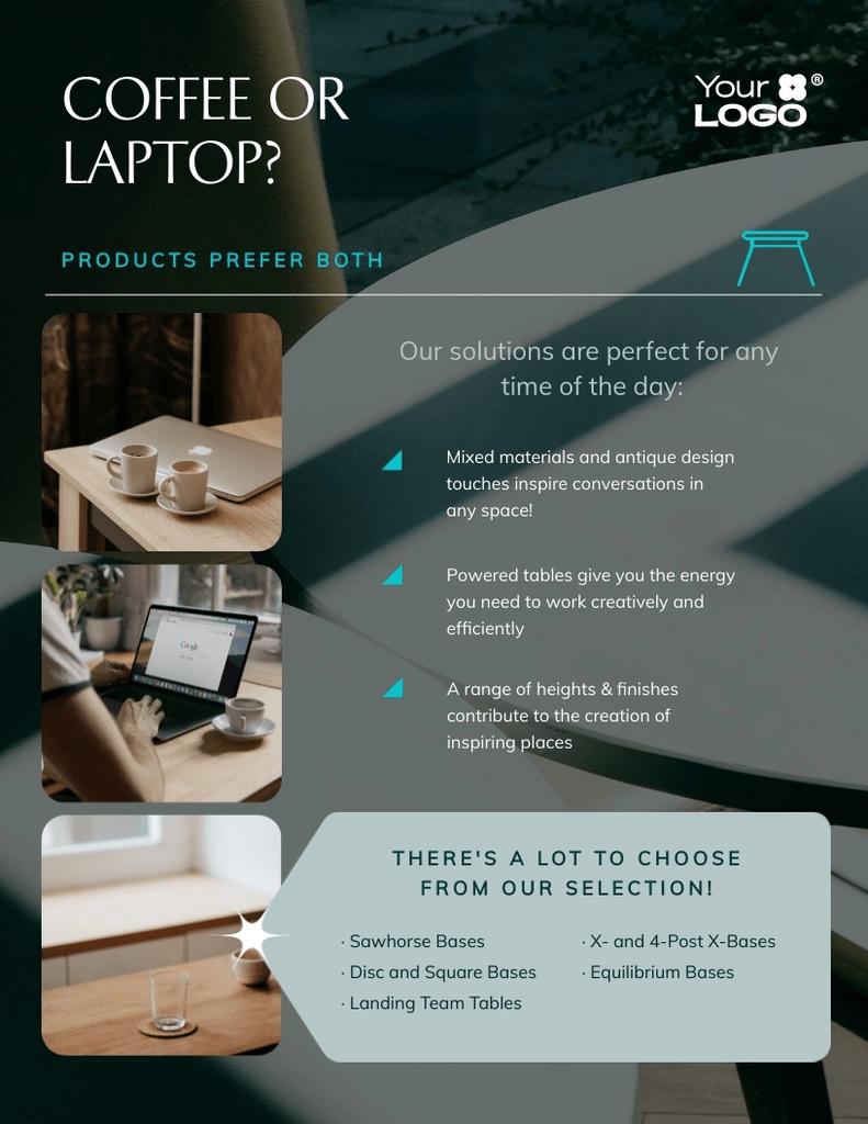
This is the Modern Product Sell Sheet template from Visme. It’s fully customizable, including the fonts, colors, and images. What’s striking about this template is the placement and size of the images versus the placement and size of the copy.
The images hold the main sway over the customer’s eye, while the copy is extremely small. You’ll also notice that the logo is on the smaller side and off to the right, rather than in the center. There’s no question that this is a template for a product sell sheet, not a company sell sheet. Multiple image slots allow the product to be featured at different angles, while limited copy lets the product images speak for themselves.
Now, let’s take a look at a company sell sheet template.

This is the One Page Company Facts Sheet template from Slide Team. Rather than focusing on one specific product, this sheet covers the company’s services, industries served, performance facts, current clients, and key personnel.
It’s also worth noting that the largest image on the sell sheet is, in fact, the company logo. That makes sense when you consider this sheet highlights an entire business, whereas a product sell sheet promotes a single item created by that business.
Creating a sell sheet: best practices
Now that you’ve seen a sell sheet example and two templates, you may be ready to create your own. But make sure you keep these best practices in mind:
Cater to your customer. Remember that most prospects prefer images over copy, so design accordingly. Take into account whether you’re designing for B2B or B2C sales, as B2B sales requires speaking to more than just one decision-maker.
Keep your copy simple. Your copy should use as few words as possible and focus on the customer’s problem(s), not the product features alone.
Include a CTA. Encourage prospects to take action by providing a clear way to contact your company or buy the product. This can be done with a link, a QR code, a product code, etc.
Anticipate questions. Think about what your prospect’s open-ended questions for sales might be, and be prepared to answer them. A B2C sale may not need many questions answered, but a B2B sale certainly will.
Design for your size. Consider your company’s size and how visible you currently are in your market. A Starbucks sell sheet can sell itself with just the logo and the name of the product, but that probably wouldn’t be the case for a start-up bakery.
Leave out the superfluous stuff. You might be excited about many of the smaller details surrounding your product or company, but be careful not to include irrelevant information. Keep the sell sheet to the point, and let the prospect do more research once they’re interested.
How Zendesk and contact management software can help
Once you have the perfect sell sheet, you need to know who to send it to. That’s where having a robust content management software solution like Zendesk can really make a difference. From providing sales email examples to walkthroughs of the sales follow-up process, Zendesk is the ideal tool to help you organize your prospects so you can get your name out there in a professional, hassle-free manner. It has sales engagement functionality married with contact and pipeline management and analytics.
With your prospects in line, you can easily see the impact of your sell sheets, who is paying attention, and who might need a follow-up email. Zendesk’s lead generation software also makes it simple to start your prospect list if your company is brand new.
To make the most of your marketing, request a demo of Zendesk today.

